Official Luthiers Forum! http://www-.luthiersforum.com/forum/ |
|
Logo & Professional Photoshoot http://www-.luthiersforum.com/forum/viewtopic.php?f=10102&t=8345 |
Page 1 of 2 |
Author: | Brock Poling [ Wed Sep 06, 2006 7:09 am ] |
Post subject: | |
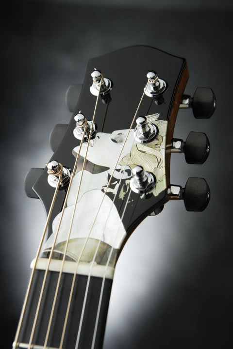
So, I have recently been reworking my logo. (Long story about why that had to happen.
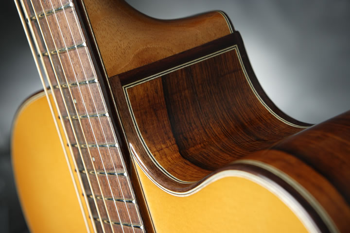
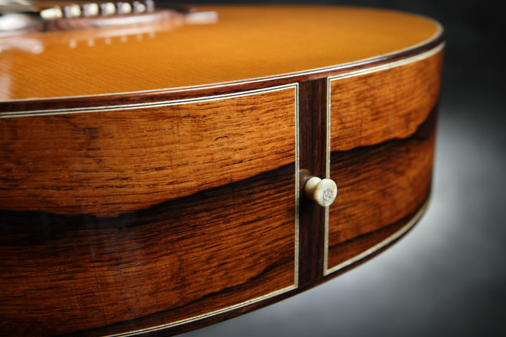
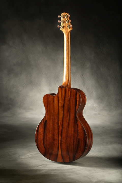
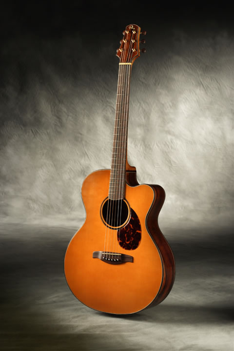
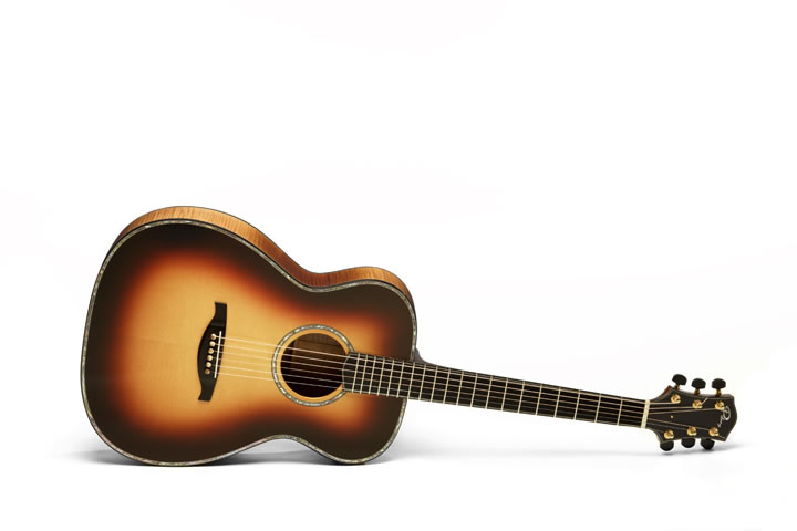
 ![]() 
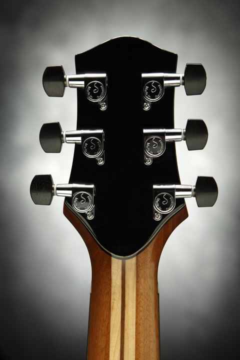
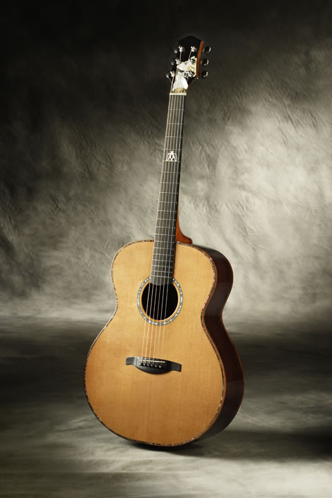
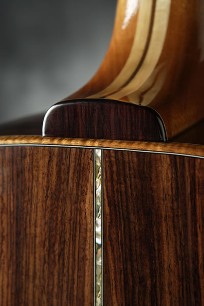
(Seems like the hardest part of a photoshoot is getting people to lend me back the guitars on the same day so I can get pics taken. This delayed me for months, so finally I just went with what I had close by. You have seen these guitars before. Sorry for the re-run, but the pics are pretty good.) Let me know what you think. ![]() ![]() ![]() ![]() ![]() ![]() ![]() ![]() ![]() ![]() |
Author: | Don Williams [ Wed Sep 06, 2006 7:24 am ] |
Post subject: | |
Have I said that I'm not only a fan of Heshtone Guitars, but also of Poling Guitars? Brock, those are great guitars, and the photographs really help to show off their beauty. I really like the color of the top on the Madrose guitar, and the burst on the OM is quite nice too. So why did you have to rework the logo? |
Author: | Brad Way [ Wed Sep 06, 2006 7:27 am ] |
Post subject: | |
Amazing! The pictures really look great! |
Author: | CarltonM [ Wed Sep 06, 2006 7:30 am ] |
Post subject: | |
Oh, yeah, Brock, VERY nice photos; and your logo is great! I think the back-of-headstock photo looks a little flat, though. Maybe if you moved the shot a bit to one side...? In any case, the instruments, logo, and photos all present a professional-looking package! |
Author: | James Orr [ Wed Sep 06, 2006 7:32 am ] |
Post subject: | |
I really like the logo. A lot. I like the shot of the headstock back; and the focus vignettes on the cutaway, lower bout, and heel. What's strange for me is the focusing in the other shots. It's soft for me. At first I thought the focus was set a few inches too forward, but it's like that in all the shots. Was this a styling choice? |
Author: | WalterK [ Wed Sep 06, 2006 7:35 am ] |
Post subject: | |
Hi Brock.... The guitar is very nice.. The photo layout is excellent... The design or theme makes me want to play it and look more... Basically it makes me hungry for more. I believe you're on to it!!!! Best of luck. Fabulous job!! walter ![]() ![]() ![]() ![]() ![]() ![]() |
Author: | Brock Poling [ Wed Sep 06, 2006 7:40 am ] |
Post subject: | |
[QUOTE=Don Williams] So why did you have to rework the logo?[/QUOTE] Essentially, I hired someone to do my last logo and told her it HAD to be an original work (i.e. don't just use a nice looking font). As the job came to completion she once again told me it was an original work. Then Larry had a very similar P. This essentially "outed" the truth and she fessed up. (So, without that coincidence, I probably would still not have known.) Ever since I have had the itch to redo it. I like this one a lot better, it is a lot more organic. Dwight helped me with this one. |
Author: | Cocephus [ Wed Sep 06, 2006 9:53 am ] |
Post subject: | |
You really have a good thing going, Brock! Rerun? Heck, your work is so nice that I could never tire of seeing it. Nice new logo, too! Coe |
Author: | Don Williams [ Wed Sep 06, 2006 9:57 am ] |
Post subject: | |
I have to agree...the new logo is very nice....better than the original. |
Author: | Sprockett [ Wed Sep 06, 2006 10:01 am ] |
Post subject: | |
Brock that looks very very good... The photos are very well done and I really like the logo, I don't regret for one second having a pro do my photo-shoot and the next batch will go in as well. Your work looks very very good.... I've thought about changing my stuff a number of times, I've take some grief over the patriotic theme, I've had friends tell me they know it turns some people off. It was not supposed to be controversial it was just who and what I am ![]() it's been rolling around in the back of my mind for some time, not only would it be a lot of work to change it but I'd have to change the website and the whole lot. I think for now I'll just keep building guitars and let the pieces fall where they may... Your stuff looks awesome ![]() -Paul- |
Author: | paul harrell [ Wed Sep 06, 2006 10:05 am ] |
Post subject: | |
The logo looks great and the guitars aren't too shabby either...........beautiful work! Peace, Paul |
Author: | Anthony Z [ Wed Sep 06, 2006 10:46 am ] |
Post subject: | |
Brock -- great shots for a website -- they project a nice professional image. Had you posted pictures of the completed Madonna guitar before? I know I bugged you some time ago to post them...if I missed them the first time -- glad to see her. Having said that and seen the pictures Craig Lavin posted and that were featured in GuitarMaker...do you have a "head on" shot or a shot from a different angle? The logo will it be going on your headstocks or label? It does look very good. Guitars look great too ![]() |
Author: | Kelby [ Wed Sep 06, 2006 11:08 am ] |
Post subject: | |
Wow, Brock, your website will look amazing! I love the logo, and the photos are first class. One questions about the approach to the photos, which I ask only because I am jumping into the world of "learning how to take pictures of your guitar," and I'm anxious to soak up all the knowledge I can. Most of the photos don't have any reflections in the finish that would suggest gloss, so the finish looks more like a matte finish. If it is a gloss finish, I'm curious to hear your thought process about avoiding reflections that would have made the gloss more apparent (although perhaps at the expense of hiding the wood). Also, roughly what radius roundover are you using on the edge of your binding? I really like it. Really nice work all around, and I'm anxious to see your new website! |
Author: | John Mayes [ Wed Sep 06, 2006 11:28 am ] |
Post subject: | |
I dig the logo brock! |
Author: | Tom Morici [ Wed Sep 06, 2006 11:35 am ] |
Post subject: | |
Brock Your work looks fantastic! Love your logo! And those photos prove the value of a Pro photographer. Your website is sure to display the class act you are. Ok I'll say it, Im impressed. ![]() Tom |
Author: | Brock Poling [ Wed Sep 06, 2006 11:43 am ] |
Post subject: | |
Thanks for the kind words guys. ![]() Anthony, I don't have a head on shot of the Madonna headstock. I figured that the GM issue did a pretty good job of capturing that, I guess I was just looking for something a little different. Paul, I dig your patriotic look. ![]() Kelby, actually we worked hard to get glare/shine off the guitars. It took an insane amount of futzing with the lights baffels and little squares of black fiber board to make them all go away. I certainly think that there are times for really shiny pics, but I really wanted the woods and the work to show through. I barely know which end of a camera to look through, so getting professional help was definitely a big plus for me. |
Author: | Joe Beaver [ Wed Sep 06, 2006 11:43 am ] |
Post subject: | |
Love the Logo!!! better than before. The pictures are very good but there is still room for improvement. (in the pictures, not the guitars) |
Author: | Brock Poling [ Wed Sep 06, 2006 11:44 am ] |
Post subject: | |
[QUOTE=Anthony Z]The logo will it be going on your headstocks or label? It does look very good. ![]() Yes, it will be on both the headstock and the labels. Dwight does excellent design work. |
Author: | Serge Poirier [ Wed Sep 06, 2006 12:27 pm ] |
Post subject: | |
Very professional Brock, Your logo and your pics are very beautiful! |
Author: | Dave Rector [ Wed Sep 06, 2006 12:46 pm ] |
Post subject: | |
Looks great to me Brock! Is that Madonna guitar a Prima? Really like your new logo too. |
Author: | jhowell [ Wed Sep 06, 2006 12:47 pm ] |
Post subject: | |
Brock-- The logo is really striking -- very well done. The photo's are gorgeous also. Professional photography is money well spent on a website. --Jim |
Author: | SteveCourtright [ Wed Sep 06, 2006 1:10 pm ] |
Post subject: | |
Just delicious. Love to "see" the wood, I can almost hear it, too, with these pics. |
Author: | LanceK [ Wed Sep 06, 2006 1:41 pm ] |
Post subject: | |
Speechless! Man that is some serious guitar! Nice stuff Brock... |
Author: | Steve Kinnaird [ Wed Sep 06, 2006 1:42 pm ] |
Post subject: | |
The photos are great, Brock, but those guitars--wow! I think that shiny guitars are one of the most difficult subjects to photograph. Looks like your photographer did an admirable job. I like the backlighting. Steve |
Author: | RichB [ Wed Sep 06, 2006 1:49 pm ] |
Post subject: | |
I guess I missed out, but I don't recall seeing these guitars before, so hats off to you! Beautiful Work....Irregardless of the Logo, which is very nice, those guitars, especially the top one, are nothing short of spectacular Brock! The photos all look great. The backdop, lighting, & shadowing are right on. I'm not a big fan of hdstk inlays per/se, but that one w/ the lady is very fine, & classy, as is the guitar. I usually like things real plain most of the time, but I'll go out on the limb this time...Great, Great Job. ![]() Can you tell me what they are (OM's, small jumbos or what)? And how about the sound... |
Page 1 of 2 | All times are UTC - 5 hours |
Powered by phpBB® Forum Software © phpBB Group http://www.phpbb.com/ |